Two-tone kitchen cabinets divide a room in the best way possible. Done right, they pull the eye to the right places, ground the floor plan, and make even a modest footprint feel composed. Done wrong, they look like a mismatched set picked from two different showrooms. The difference sits in planning, proportion, and a handful of field-tested details that never make it into glossy photos. After designing and installing hundreds of cabinet packages over the past decade, here is what consistently works, what trips people up, and how to steer your project toward the kind of finish that keeps looking good five years later.
Why two-tone works when the rest of the room is working against you
Kitchens are cluttered by nature. Appliances, outlets, hardware, tile joints, and window muntins all create visual noise. A two-tone cabinet plan can quiet that noise by assigning visual weight. Darker bases anchor the room, lighter uppers lift the ceiling, and a contrasting island builds a focal point that absorbs attention. When you add a capable lighting plan and a backsplash with the right grout color, the whole composition starts to read as one intentional space rather than a series of parts.
I like two-tone palettes in homes with low or standard ceiling heights, particularly the 8 foot ceiling common in mid-century houses and many Chicago bungalows. The light upper run tricks the eye into perceiving more height, while the darker base conceals toe-kick shadows and the scuffs that accumulate in a working kitchen. If you have a vaulted ceiling and a wall of glass, the effect shifts. You may prefer slightly warmer or mid-tone uppers so the room does not feel top light and washed out.
The three dependable two-tone strategies
There are endless variations, but three compositions rarely miss.
First, light uppers with dark lowers. This is the classic. Think warm white uppers, deep navy or charcoal bases, brushed brass or satin nickel hardware, and a countertop that ties both together. Second, a contrasting island against uniform perimeter cabinets. This keeps the walls calm and lets the island take the attention. Third, wood grain paired with paint. A walnut or white oak base with painted uppers reads rich and layered without getting busy. Wood on the base gives you durability where it counts and a tactile break from an all-painted room.
Within these strategies, proportion is the guardrail. Reserve the darker shade for roughly 40 to 60 percent of the total front elevation so the kitchen feels anchored, not gloomy. In galley kitchens with tight corridors, lean toward lighter bases and a deeper island tone if you have one. In large open concept rooms, you can afford a heavier, darker perimeter because natural light and air volume balance it out.
Color selection, the experienced way
Swatches lie, and lighting changes everything. Paint that reads as balanced gray in a showroom can skew blue at home, especially under cool LEDs or northern light. I ask clients to test at least six 12 by 12 inch samples on site, two steps in tone: one lighter than the target, one darker, on both the upper and lower runs. Look at them morning, afternoon, and evening. If your kitchen sits in a Chicago home with winter blues from short daylight, compensate with a touch of warmth in the upper tone so the room does not turn sterile in January.
Many homeowners want pure white, then regret the upkeep. A soft white with a drop of gray or cream hides splashes and still feels crisp. On the dark side, greens and blues hold depth better than true black, which shows lint and micro-scratches. Deep forest green bases with unlacquered brass hardware deliver elegance without reading trendy. Navy bases feel classic but benefit from a matte or satin sheen to avoid glare. If you crave black, try a charcoal with brown undertones. It plays well with both warm and cool counters and wood tones.
Sheen, durability, and how to clean it later
Paint sheen matters more than most realize. On bases, satin or matte holds up better to mopping and shows fewer micro-scuffs, provided the finish is catalyzed and cured correctly. Semi-gloss on uppers can look almost plasticky under direct under-cabinet lighting and highlights roller marks if the painter does not spray. For a uniform, furniture-grade result, a pre-catalyzed lacquer in satin on both runs is hard to beat. It cleans with mild soap and water, resists water rings at the sink, and looks refined.
Hardware finish can amplify or soften your sheen choice. Brushed finishes pair well with satin paint and reduce fingerprint visibility. Polished chrome against matte paint can look sharp in modern homes but will double every smudge if you have small children.
Where countertops and backsplashes earn their keep
Two-tone cabinetry needs a peacemaker, and countertops usually play that role. If your bases are dark and uppers are light, a white veined quartz with soft gray or taupe movement can bridge the gap without visual chaos. In busy households, quartz remains the workhorse. Porcelain slabs are gaining ground, especially in Chicago where resistance to staining and hot pots helps with entertaining. Natural stone is beautiful but demands care. If you insist on marble, consider a honed finish with a sealer and accept patina as part of the kitchen’s story.
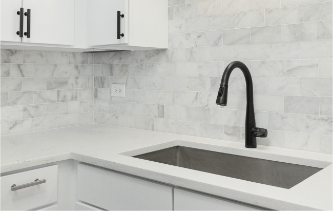
Backsplashes should either fade into the upper cabinets or act as a measured accent. Be mindful of grout color. With white uppers, a warm white grout will keep tile joints from shouting, especially under LED under-cabinet lighting. For easy cleaning, large-format porcelain or a full-height slab behind the range makes sense. If you opt for handmade tile, keep the color quiet so the variation becomes texture, not a third dominant tone.
The case for wood and how to keep it from feeling rustic
Natural wood base cabinets are having a long, calm moment. Quarter-sawn white oak with a matte clear finish plays well with almost any painted upper. Rift-cut oak reads modern, while a light wire-brush adds gentle texture that hides nicks. Walnut https://josueeomm941.lowescouponn.com/lighting-design-101-layering-ambient-task-and-accent-lighting brings depth but can skew formal unless you balance it with simple hardware and a light, non-glossy countertop. If you fear the room leaning rustic, avoid heavy knots and keep door styles clean. Flat panel or a slim shaker with a 1.5 inch rail sits nicely between styles.
The invisible planning that makes two-tone feel intentional
Trim and terminations make or break the palette. Exposed cabinet sides should match their attached run, not the door style alone. If your lower run is dark, the end panel at the island and the cabinet gable facing the breakfast nook should carry the dark tone as well, or the composition fragments. For uppers, match crown and light rail molding to the upper color so the top of the room reads continuous. Toe-kicks on dark bases should be painted or veneered to match, not left black by default. Under-cabinet lighting temperature should be set before you sign off on paint, or you risk warm-toned light turning your careful gray into a dingy beige every evening.
Vent hoods deserve specific attention. A metal hood introduces a third material. If your kitchen already has mixed metals, let the hood match the dominant cabinet hardware, then keep the faucet and pendants in the secondary finish. If you want the hood to disappear, paneled hoods painted to match the uppers keep the eye on the island instead.
Budget levers you can pull without weakening the design
Two-tone does not require two cabinet lines. If you are planning a home renovation on a budget, spend on cabinet boxes and drawer hardware, not premium colors. Many semi-custom manufacturers let you choose one painted color at no premium and charge for the second. In that case, put the premium on the island alone, or choose a standard color for uppers and a stained wood base that comes at the same price tier as paint. You still achieve contrast without surcharge.
If the budget is tight and you are refreshing an existing kitchen, you can often keep the existing boxes, add new doors, and spray the lowers in a durable catalyzed finish. Swap out 3 to 4 inch finger pulls for 6 to 8 inch bars on drawers for better ergonomics and visual proportion. Under-cabinet lighting is a small cost that elevates everything, especially in a two-tone scheme where shadows matter.
What we learned on the job at Revive 360 Renovations
On a recent kitchen where the homeowners wanted light gray uppers and black bases, the room looked elegant at noon and gloomy at dusk. In walkthroughs, we noticed the pendant bulbs were 4000K and the under-cabinet strips were 3000K. The mismatch pushed the gray into a cold range while the base read as a void. We swapped to 3000K across the board and added a small cove light above the crown, hidden with a 1.5 inch return. The result felt warm and cohesive all day. These adjustments cost less than 2 percent of the total project, but the perception of the palette changed completely. Details like color temperature and light direction sound technical, but they are central to a two-tone plan.
Another Revive 360 Renovations job involved a narrow Chicago rowhouse with 8 foot ceilings and a single east-facing window. The client wanted navy bases and bright white uppers. On paper, fine. In the field, the room took the navy well, but the white uppers flashed blue at sunrise. We moved to a soft white with the slightest yellow undertone and a satin sheen. We also extended the uppers to the ceiling with a modest crown to avoid a dust shelf. The kitchen kept its punch without the chilly morning cast.
Revive 360 Renovations on workflow and protecting your home during finishing
Two-tone kitchens typically involve spray finishing, whether in a shop or on site. Overspray is the enemy of flooring and appliances. At Revive 360 Renovations we learned to tent the spray area with zipper walls, cover HVAC returns, and keep a negative air machine running so the rest of the home stays clean. If you are living through a remodel, minimize disruption by scheduling the most odor-heavy work on days you can be out, and by setting up a temporary sink. A folding table, a plug-in induction plate, and a rolling cart can carry a household for three weeks without too much pain.
Cabinet installation wants a clear path. Protect your belongings by moving artwork, covering adjacent furniture, and wrapping stair rails. It sounds basic, yet most of the damage we see in rescue jobs comes from avoidable bumps on delivery day, not from carpentry errors.
Layout choices that either help or hurt your palette
Open concept vs. traditional layouts change how two-tone reads. In open concept spaces, the kitchen is part of the living realm, so the palette should echo adjoining rooms. If your living room leans warm with oak floors and beige textiles, a warm white or mushroom upper will tie it together better than stark white. In more traditional compartmentalized homes, you can push contrast harder because the kitchen has its own identity.
Islands deserve their own study. A contrasting island works best when it is sized and detailed as a piece of furniture. That means end panels, posts or legs, and a slightly varied countertop edge. If you paint the island darker than the bases, be sure the flooring can carry that weight. With very dark floors, a near-black island can disappear. In those cases, flip the script with a natural wood island that breathes.
Hardware, fixtures, and the quiet power of consistency
Two-tone cabinets already ask the eye to process contrast. Do not add a fourth or fifth voice without a reason. Mixed metals can be beautiful, but set a hierarchy. For example, use satin brass on all cabinet hardware, chrome on plumbing fixtures for performance, and black on lighting. Or pick one metal and vary texture: brushed on hardware, knurled detail on appliance pulls, and a soft patina on the faucet. Choose fixtures and hardware that last, not just for finish durability but also for ergonomic comfort. Oversized pulls on heavy drawers reduce stress on the finish and the person using it.
Counterpoint from the field: when two-tone is not the right answer
Not every kitchen wants two tones. Very small kitchens with visually busy floors, such as classic black and white checkerboard, may benefit from a single cabinet color so the room does not feel chopped up. Kitchens with a strong showpiece, like a veined marble slab that climbs to the ceiling, can also prefer a single-tone cabinet plan that lets the stone be the star. If resale is the top priority in the next two years, a restrained two-tone, such as warm white uppers and soft greige bases, typically appeals to more buyers than trend-forward combinations.
Maintenance realities five months, two years, and five years in
Paint settles and houses move. Five months after install, hinges and doors sometimes need a tweak, especially tall pantry doors. Tighten hardware, adjust reveals, and note any hairline seams at face frames. Two years in, expect touch-up at dishwasher panels and trash pull-outs. Keep a small jar of your exact finish for repairs. Five years in, most well-finished cabinets still look excellent if you have used mild cleaners and soft cloths. Avoid abrasive pads. For wood bases, refresh with a conditioner, not oil soap, which can cloud the finish.
The best backsplash materials for easy cleaning continue to make a difference over time. Full-height slabs, large-format porcelain, and smooth glass subway tiles wipe down quickly and help your beautiful two-tone palette read clean at a glance.
Lighting layers that show off the palette instead of fighting it
A two-tone kitchen benefits from three layers of light. Ambient light should be even and dimmable. Task lighting under cabinets should be consistent in color temperature and brightness along the entire run, without hot spots. Accent lighting, like a tape light in a cove or inside glass-front uppers, adds depth at night. Keep all layers within the same 2700K to 3000K range so colors stay true. Dimmers let you adjust for gray winter days or bright summer evenings. With lighting design, small changes deliver outsized benefits.
Planning cadence that keeps the finish line in sight
You can create a remodeling timeline that works by sequencing decisions in the right order. Choose layout first, then appliances, then cabinet line and door style, then colors and hardware, then countertops and backsplash, then lighting, and finally paint for walls. It is tempting to pick the perfect navy on day one. Resist that. Body colors after all fixed finishes lock. This order reduces change orders and the hidden costs of home remodeling that surprise even seasoned homeowners.
If you are wondering how to hire the right contractor for your remodeling project, ask to see two-tone kitchen examples they have built, then look closely at seams, end panels, and how the transition between colors is handled at corners and appliance panels. A good contractor clarifies where each color terminates and shows you mockups or 3D views before the shop builds.
A note on Chicago conditions and why they matter
For Chicago homes, humidity swings and seasonal light change how finishes behave. Winter air is dry, summer is humid. Wood moves. Allow the cabinet shop to acclimate materials on site for at least 48 hours before install, or you risk seasonal door warp. The best time of year to remodel your home in Chicago often sits in late winter through spring, before humidity peaks. That schedule also lines up well with production queues and can cut weeks from lead times.
City regulations matter. If you are touching walls, moving plumbing, or adding circuits for smart home technology integration during remodeling, permits and inspections will shape your timeline. An experienced team will fold this into planning so finishing does not collide with an open inspection.
Design through the lens of function
Families cook differently. The best countertop materials for busy families are not theoretical. If you make sheet-pan dinners and bake on weekends, a honed quartz with subtle movement hides flour dust and wipes clean. If you host and treat the island as a buffet, look for a counter with gentle veining that will not show every crumb. Two-tone cabinetry can help zone function. Darker, more durable finishes on the cooking wall, lighter cabinets near the coffee bar or glassware display. In smaller kitchens, plan storage that actually works by dedicating top drawers to everyday tools and keeping display to one or two cabinets so the palette stays calm.
Edge cases and how to navigate them
- Tiny galley kitchen with minimal light: choose light bases and slightly warmer light uppers, then use a darker island or butcher block cart as your contrast rather than painting lowers dark. Older homes with uneven floors: before you commit to flush toe-kicks and tight reveals in two colors, check floor leveling. If the floor is out by more than 3/8 inch over a run, you will fight uneven paint lines. Houses with pets and kids: pick satin finishes, soft-close hardware, and pulls instead of knobs on heavy drawers. Two-tone survives best when everyday use is smooth. Minimalist modern spaces: aim for two tones that are close in value but different in temperature, like warm putty bases with cool white uppers. The contrast is refined rather than high drama. Homes with strong natural materials: if you already have bold stone or pronounced grain in flooring, keep cabinet contrast soft so textures do not compete.
Before you lock your palette, test it with real materials
Nothing beats a full-size mockup. Take one base cabinet door and one upper door in your shortlisted colors into your space along with a 2 by 2 foot sample of your counter and a backsplash tile. Prop them up in the room. Turn on the lights you will use at night. Look for undertones that clash. Does the warm white upper turn green beside your quartz? Does the dark base pull purple near your walnut floors? Adjust until each piece feels like it is part of the same story.
This is also the time to consider how to maximize natural light in your home renovation. A simple reflective backsplash, a slightly higher sheen on the upper paint, or a light shelf at a window can boost brightness without altering your cabinet plan.
A reality check on trends and staying power
Two-tone cabinets are not a new gimmick. European kitchens have blended wood and paint for decades. What comes and goes are the exact hues. If you want longevity, anchor with neutrals. If you want a trend-forward pop, do it on the island or on a beverage hutch that can be refinished in a weekend. Trends that will become outdated soon often layer high-contrast colors with showy hardware and busy backsplashes. Pick two heroes, not five.
How Revive 360 Renovations documents and hands off a two-tone kitchen
At project closeout, we leave clients with a finish schedule that lists manufacturers, color codes, sheen, and lot numbers. This small packet saves headaches later. If a door needs replacement or a panel gets damaged, you have the exact recipe. We also photograph the kitchen under both daylight and evening lighting to verify that the tones read as intended. That step started as an internal quality check at Revive 360 Renovations and became a client favorite. When you can see that the palette holds in different conditions, you stop worrying and start cooking.
Bringing it together
Two-tone kitchen cabinets succeed when the choices align with how the room works. Respect proportions, finish durability, lighting temperature, and the way your family uses the space. Think of color as a tool that allocates attention: darker where you want weight, lighter where you want lift, wood where you want warmth. Match end panels, mind transitions, and keep the palette disciplined. A two-tone kitchen does not ask to be admired. It simply looks right, morning to night, and keeps looking right after the first holiday roast, the third birthday cake, and the hundredth coffee brewed before the sun comes up.